5 Design Tips for Better Conversion
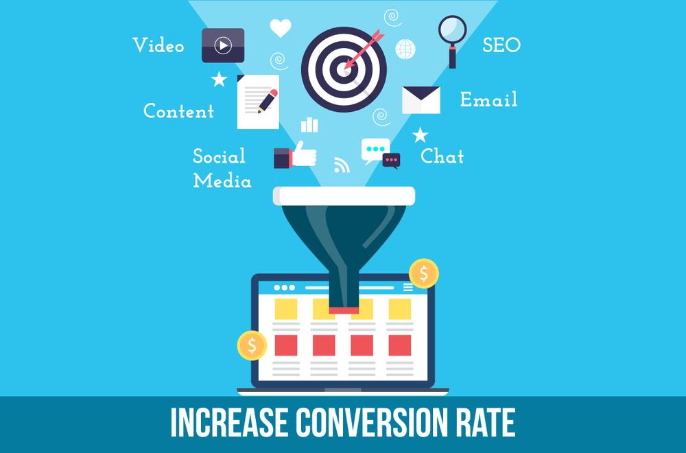
Without mincing words, a website is very important for the success of any business. It is a very vital marketing tool that helps grow businesses. However, for your website to enjoy a high rate of conversion, it needs to meet with the expectations of your visitors.
Generally, visitors will only be willing to take action on a website if they’re satisfied with what the site offers, both in terms of user experience and content.
In this article, a professional web design company in Toronto pixelcarve.com puts together 5 simple design tips you need to implement to optimize your website’s conversion.
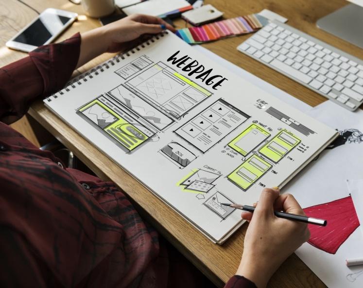
- Design with your users in mind –
A website that fails to attract visitors is of no use to anyone. And when your website cannot meet your visitors’ expectations, you’ll definitely lose out on traffic. One way to ensure that is to have a responsive design. A large number of website visits are increasingly done on mobile devices, and it is safe to assume that this number will increase.
A responsive design adapts your website to any screen size your visitor is browsing with – desktops, laptops, mobile phones and tablets. This way, every aspect of your website is well displayed regardless of the device your visitors are using.
- Choose simplicity over complexity –
Back in the day, complex designs and flashy websites were trendy. If you didn’t have flash and animations on your site, you were not ready to own a share of your market. But today visitors are no longer interested in complex or showy sites.
Visitors look for a sites that can offer them usability and functionality. This means a simple minimalistic design that contains only the necessary components.
Apart from being aesthetically pleasing, a simple website also improves your website load speed. This boosts user experience and leads to better conversion.
- Keep your navigation simple.
Your site visitors should be able to easily and quickly locate the content they need, and not have to try to scale through some a complex navigation structure. If your visitors have to spend a long time searching for what they need, they may get frustrated and go elsewhere.
The secret is to keep your navigation as simple as possible. Having too many links and options will only confuse and overwhelm your users, and if there’s ever a thing a visitor hates most, it is feeling foolish on a website. It is important that you make it easy for your visitors and customers to perform the action you want them to perform, whether it is signing up for a newsletter or getting to a specific product page. 
- Include catchy videos
People tend to remember more what they see than what they read; so you should make visuals an important element of your website. Studies have shown that websites with videos convert more than those without, by as much as 70%. Use videos to emphasize any important message on your website. This will increase your traffic and boost your conversion ratio.
You may need the following tips to create a video that converts.
- Try to keep it below 2 minutes.
- Use relevant pictures and visuals; don’t make your video all about charts and numbers.
- Ensure that you capture the attention of your audience within 20 seconds.
- Use the K.I.S.S Principle (Keep It Simple, Short and Straight).
- Use persuasive Call to Actions
Call-to-Actions (CTA) are essentially what you need to boost conversion on your website. CTAs are important because they summarize to your visitors the solutions you’re offering.
There are many websites without clear and persuasive CTAs, which keeps the site visitors confused about what they can expect from the website. So make sure your message is clearly defined and visible on your website.
Here are two simple tips for your call to action buttons –
- The color of your call to action buttons should contrast nicely with the background color of your website. For example, if your website has a white background, a blue CTA button color will do nicely. It will help your users easily find the call to action.
- The text on your call to action should be catchy enough to attract the interest of your visitors. Rather than use words like submit or subscribe, use words that tell your users what they would get if they click on the button.
Over to you
If you’re having trouble getting your site visitors to convert, then there may be something wrong with your current template or layout, and you may need to have another, more professional look. The importance of new design for conversion rate optimization cannot be overemphasized.
The rules of internet marketing have changed, and unless you’re willing to change along with it, you may find your business losing relevance in the industry.